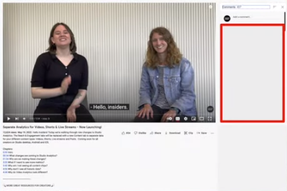
YouTube is changing the way that video comments are displayed on desktop, with a new ‘teaser’ type presentation, which will show a single comment below the clip. When expanded, however, the new desktop comments stream will soon open to the right of the playback window, as opposed to expanding below.
Right now, on mobile, YouTube displays a teaser, which features one comment below the playback display.

Tap on that comment and it opens a new comment panel, which displays all of the video comments below the clip, which you can then scroll through.
On desktop right now, all video comments appear below the video player, but soon, you’ll only see a single comment, which, when tapped, will open up a new comments stream at the right of the playback.

As you can see here, rather than scrolling downwards to look through the responses, users will soon be able to scroll through the comments at the right of the main screen.
YouTube says that the goal of this new format is to enable viewers to continue to watch the video while they scan through the various comments, in order to provide more context in a more integrated experience. The change will also bring its mobile and desktop UI more into line.
Which makes sense, and it does make it easier to be able to skim through the comments during the playback. It’ll just be a bit of an adjustment – and no doubt many users will be annoyed at the change, in the initial period, as it’ll require new usage behaviors in the app.
But it could provide helpful context for replies, with the playback aligned with the notes as you scan. It could also lead to new engagement behaviors, with users able to use arrows and other emoji characters to prompt interaction between the comment and the playback.
It seems like a fairly logical development – though again, change is generally not welcomed by users, especially when it relates to functionality like this, which has existed in YouTube for decades.
But it could be a handy addition. YouTube says that it’ll be rolling out the new format from this week.

 Technology
