YouTube has announced a range of visual tweaks and UI updates, which it says are intended to make the app feel ‘cleaner, more lively’, and easier to use for different purpose.
The biggest update is pinch to zoom, which enables users to expand the playback screen to examine certain details or elements.
Similar to how you can expand Instagram images, pinch to Zoom on YouTube will provide another way to interact with video content, which could be handy for more precise tutorials – or just to see if that’s really what you think it is in the background.
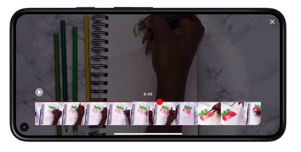
YouTube’s also rolling out more precise seeking to help users find the exact point of a video clip they need to skip to.

As per YouTube:
“Have you ever followed along to a tutorial on your phone, but needed to keep rewinding so you could master that one small step? Precise seeking helps solve this problem. Whether you’re on desktop or your mobile device, simply drag or swipe up while seeking to display a row of thumbnails in the video player and you’ll be able to make fine-tuned adjustments to get to the exact part in each video.”
YouTube’s also rolling some visual presentation updates, including Ambient Mode, which provides a more visually aligned viewing experience.

As you can see in this image, Ambient Mode adapts to the color of the videos on screen, with the background shifting slightly to put more focus on the main content.
“Using dynamic color sampling, ambient mode introduces a subtle effect so the app background color adapts to match the video. We were inspired by the light that screens cast out in a darkened room and wanted to recreate the effect so viewers were drawn right into the content and the video takes an even greater focus on our watch page.”
YouTube’s also added a new ‘Darker’ Dark Mode – ‘so the colors truly pop on your screen’.
It’s also updating its links in video descriptions to buttons, while it’s also changing the format of the Like, Share, Download and Subscribe buttons to minimize distraction in playback.

Switching the Subscribe button from its current red color, which makes it stand out, could be a risk, but YouTube has moved to reassure creators that the new format will still attract attention.
“The new shape and high contrast make it really stand out, and while it’s no longer red, it’s easier to find and way more accessible to everyone on both watch pages and channel pages.”
YouTube’s also changed the color of hashtags (from blue to white), though the functionality and placement remains the same
“Viewers can still click on hashtags to discover content, your hashtags will still appear in your video description, and your videos can still appear in search results or hashtag Pages for those hashtags.”
Though the change in color may make hashtags less prominent. You can see in the image above that the white hashtags aren’t as up front, which could draw fewer clicks.
Which is interesting considering YouTube has been working to improve hashtag usage in recent months, by highlighting more relevant hashtags in video clips.
It’ll be interesting to see how this change impacts hashtag engagement.
All of these changes are relatively minor, in broader scope, though Pinch-to-Zoom, in particular, is a valuable and significant update to the platform’s overall UI.
The other changes are likely to have less functional impact, though it will be interesting to see how they impact in-app engagement and discovery actions from clips.
You can read more about YouTube’s design changes here.


