Oh wow, what a surprise this is.
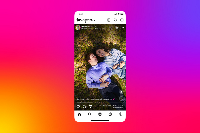
As reported by TechCrunch, Instagram has launched an initial test of a new, full-screen variation of its main feed display, which makes IG content look a lot more like TikTok, leaning into the latest usage trends.

Which is not a huge surprise because the updated UI was spotted in testing back in March, with reverse engineer Alessandro Paluzzi posting this example.
Which makes sense – Instagram has already said that it’s working to align its content feed around Reels, given the popularity of the format, while just last week, Meta noted that Reels already makes up more than 20% of the time people spend on Instagram.
As such, it seems like a no-brainer for Instagram to move further in this direction – though TechCrunch does note that Stories would remain at the top of the screen in this new layout, with the Stories bar still positioned along the top of the app (it’s just not visible in the above example).
But eventually, that too will change.
As you can see in the above video example, there are actually Stories integrated into this full-screen display format, with a frame indicator along the bottom of Stories posts, which prompt the user to swipe left to see the rest of the content.
I would hazard a guess that this is the ultimate end-game for this new layout, which would bring all Instagram content into this updated display layout, and make it easier to catch up on all IG content in a single stream.
The only real complication is that Instagram makes money from Stories ads, displaying full-screen promotions in between Stories.
That’s likely why Instagram’s not looking to merge everything together as yet – but as it advances its monetization tools, you can bet that this is where things are headed, with all Instagram content to flow through a full screen, scrollable feed of static posts, Reels and Stories, all in one.
It’s not here yet, but it’s coming, and this new experiment is the first step towards the next iteration of the ‘Gram.


