This could be handy.
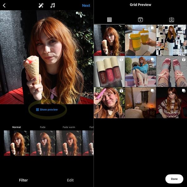
Instagram is currently testing a new option with some users that enables you to view how your feed posts will look on your profile grid before you publish, so you can ensure that each update fits into your overall IG aesthetic.

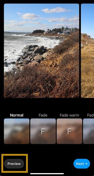
As you can see in this example, shared by Nadja Bella Marrero on LinkedIn, some users are now seeing a new “Show preview” button within the post composer process. Tap on it, and it’ll then give you a preview of where the post will fit into your current profile format, including pinned posts.
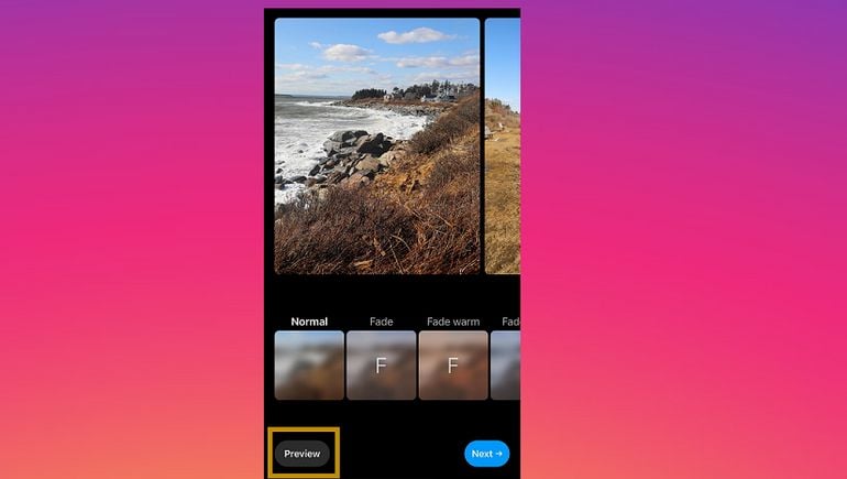
Social media expert Linsey Gamble has shared an alternate version of the button:

That could make it easier to maintain the overall theme and feel of your profile, and ensure that everything that you post aligns with the approach that you’re taking to your main IG presence.
It’s not a game-changer, nor a huge functional change, but it’s a handy update that could help you decide what to post to IG, and when, in order to maximize your profile impact. Maintaining a consistent approach is key to building your in-app presence, and with that in mind, there could be a lot of value in ensuring that you have the right posts in the right place ahead of publishing.
For those who have the option available, it’s now appearing for all single image, video, and carousel updates, though not for your Reels feed as yet.
We’ve asked IG for an update as to who has it, the scope of the test, and what the plans are for a broader roll-out, and will update this post if/when we hear back.


