The impact of ChatGPT extends beyond the interface itself, with a growing number of platforms now looking to integrate more conversational UI elements into their systems, in order to align with evolving habitual trends, which many now see as the future.
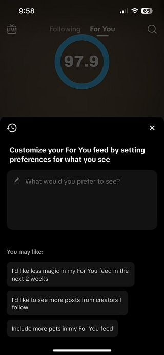
TikTok is the latest to latch onto this, with a new “Customize Feed” option within your “For You” page settings that lets you enter in conversational guidance on what you want to see more, or less of, in-stream.

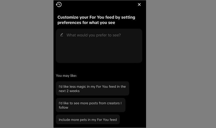
As you can see in this screenshot, shared by Jonah Manzano, TikTok’s new customization tool provides a simple text field, where you can enter in a preference, like “I’d like to see more posts from creators I follow”, which TikTok will then use to customize what it shows you.
You can even ask it to show you different content for a certain period of time, with the process intended to make it easier for users to be more specific about what they prefer, without having to rely purely on in-app engagement triggers.
Which, as noted, is more in alignment with the conversational UI of ChatGPT, in enabling users to enter in less technical queries to improve their in-stream experience.
Which might work, and it might actually become more necessary in all apps, as users continue to become more accustomed to simply asking for what they want, as opposed to being experts in Boolean search operands. But at the same time, this type of specificity can also lead to less beneficial results, because often what users think that they want, and what they actually prefer, are two different things.
Meta is a good example of this. Repeatedly, users on Facebook and Instagram have voiced their displeasure at not having a chronological timeline, at having too many Reels from profiles that they don’t follow show up in-stream, at not seeing enough updates from friends and family, etc.
All of these are valid complaints, but Meta has also shown that when they do align with such, usage generally declines.
That might also be an indicator of the fallacy of social media trends, in that what’s getting the most attention, when measuring by comments, shares, and likes, is not always indicative of what the majority of people actually care about at any given time.
Divisive issues logically drive more engagement, but in the majority, those issues are not what’s impacting most people’s day-to-day existence. But that engagement then sees media organizations put more focus on these divisive topics, as they help to drive more traffic, which then leads to even more online discussion, and an even bigger, broader focus on such, despite the majority of people not necessarily engaging with it.
Research shows that the vast majority of social media users don’t ever post themselves, which means that the bulk of in-app engagement is driven by a vocal minority, but is not always indicative of key trends for general users.
As such, actual time spent reading content is a better indicator, and more indicative engagement measures like this are, gradually, where social platforms are headed, in order to guide their algorithms, as opposed to what’s sparking more replies and shares.
The risk with guidance elements like this one from TikTok is that TikTok users will look to use them as a filter, which will actually then lessen their experience. But at the same time, TikTok likely knows that a) most people simply won’t bother to use it, and b) it’s likely not giving this element a lot of algorithmic weight. So it might make people feel better in having a say on such, but it probably won’t be as influential as they may perceive.
In any event, it’s another indicator of the growing shift towards conversational UI, and how it’s slowly creeping into more elements, as platforms look to merge with evolving user behaviors.
That could be even more relevant on TikTok, where the next generation of users are engaging, but it seems like a minor consideration at this stage.


