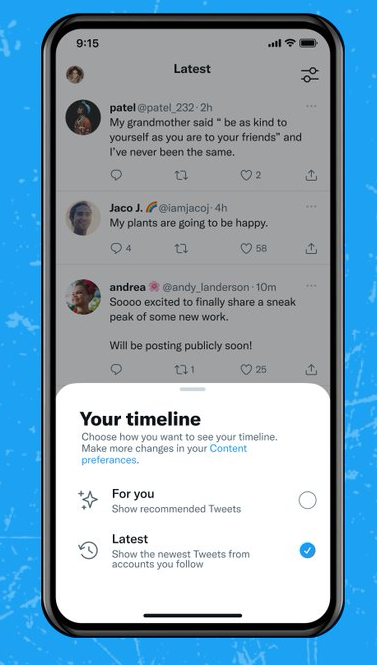
Twitter’s trying out yet another option to give users more control over their tweet experience, with updated descriptions and icons when switching between the algorithm-defined and latest tweet timelines.

As you can see in this example, the new presentation makes it a little clearer which timeline you’re viewing, and how to switch between them, which could make it easier for users to understand how to control their own tweet experience.
As noted, it’s the latest in a long line of Twitter updates designed to give users more control over their on-platform experience.
Over the past year, Twitter has added:
The various tools and features could fundamentally change the tweet experience over time, as users opt for more private sharing, essentially segmenting what had been public discussion in the app.
Which had always been Twitter’s driving ambition, to be the ‘virtual town square’, where everyone can have their say on anything they like, at any time. But as social media usage has evolved, more people have shifted away from public sharing in favor of smaller groups, in order to avoid the criticism, and reputational risk, that can be associated with posting everything in public for all to see.
Which is why Twitter’s now trying to lean into this, with its algorithm controls providing another customization element that can help users define their own tweet experience.
It’s not a big change in the broader scheme, as it doesn’t add any direct functionality, as such. But it could make it a little easier to manage your own Twitter experience, aligning with this broader shift.


