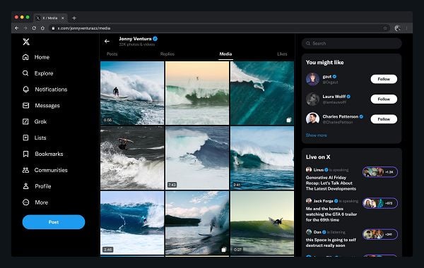
If you’ve tapped over the “Media” tab on any X user’s profile of late, you may have noticed a change in the way the content is displayed in-stream.

Over the last few weeks, X has been rolling out its new grid display format, so rather than a list of posts with media included, you can now get a better view of the various video and image uploads from a specific account.
It’s not available for all profiles as yet, but it is coming, so if you’re not seeing it in your app, you will be soon.
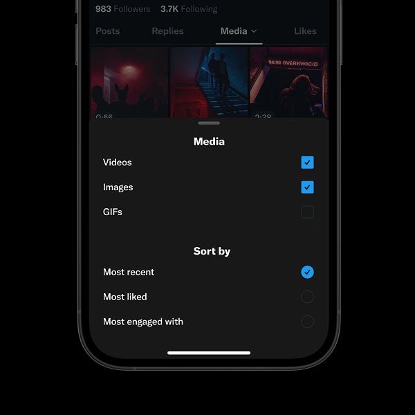
And you’ll also soon be able to sort through them even faster, with new filters coming for specific media types.

As you can see in this example, posted by X designer Andrea Conway, you’ll also be able to filter the results based on engagement, so you can easily find the most popular media posts from any given account.
Is that an improvement?
I mean, it certainly makes it easier to sort through all of a profile’s videos and images, but it is a change in process, which will take some getting used to. Having more search filters will certainly help, and I think that, over time, it will be an improvement in searching for content in the app.
But it’s a bit weird right away. If you’re used to searching through profiles via the “Media” tab, it does require some recalibration, but it’s a handy change that should help.
And as X continues to put more focus on video content, maybe, the thumbnail approach will make it more appealing for creators to upload episodic content, which will then be more easily searchable. X could also look to build in playlists and other functions similar to YouTube to further refine discovery.


